Why does the article not have mostly harmless as its short description or otherwise summarize the article's content using it?
This has been discussed several times including (12345). The consensus is that it fails WP:42.
This article is written in American English, which has its own spelling conventions (center, color, defense, realize, traveled) and some terms may be different or absent from other varieties of English. According to the relevant style guide, this should not be changed without broad consensus.
This article is within the scope of WikiProject Astronomy, which collaborates on articles related to Astronomy on Wikipedia.AstronomyWikipedia:WikiProject AstronomyTemplate:WikiProject AstronomyAstronomy
This article is within the scope of WikiProject Geography, a collaborative effort to improve the coverage of geography on Wikipedia. If you would like to participate, please visit the project page, where you can join the discussion and see a list of open tasks.GeographyWikipedia:WikiProject GeographyTemplate:WikiProject Geographygeography
This article is within the scope of WikiProject Geology, an attempt at creating a standardized, informative, comprehensive and easy-to-use geology resource. If you would like to participate, you can choose to edit this article, or visit the project page for more information.GeologyWikipedia:WikiProject GeologyTemplate:WikiProject GeologyGeology
This article is within the scope of WikiProject Science, a collaborative effort to improve the coverage of Science on Wikipedia. If you would like to participate, please visit the project page, where you can join the discussion and see a list of open tasks.ScienceWikipedia:WikiProject ScienceTemplate:WikiProject Sciencescience
This article is within the scope of WikiProject Culture, a collaborative effort to improve the coverage of culture on Wikipedia. If you would like to participate, please visit the project page, where you can join the discussion and see a list of open tasks.CultureWikipedia:WikiProject CultureTemplate:WikiProject Cultureculture
This article is within the scope of WikiProject Spoken Wikipedia, a collaborative effort to improve the coverage of articles that are spoken on Wikipedia. If you would like to participate, please visit the project page, where you can join the discussion and see a list of open tasks.Spoken WikipediaWikipedia:WikiProject Spoken WikipediaTemplate:WikiProject Spoken WikipediaSpoken Wikipedia
Other talk page banners
This article was nominated for deletion. Please review the prior discussions if you are considering re-nomination:
Complaints about the lack of young Earth creationism or similar points of view are inappropriate content for this talk page. For an overview of Wikipedia's position on creationism or young Earth-related topics, please see the FAQ at Talk:Evolution.
The upside down but more familiar to viewers version
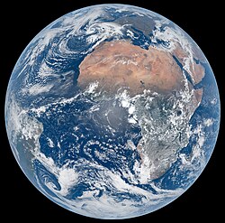
I'm excited to see the new "Hello World" photo from Artemis II; Reid Weisman did a great job. It'd be neat to use this type of photo as the lead image—that's why we had "Blue Marble" up for so long. But there's already a consensus from a previous discussion to use a high-resolution photo taken from a satellite—namely Meteosat—instead of the "Blue Marble". I don't quite think that the Artemis II photo is actually better than the Meteosat photo, so I'll start by listing the cons:
"Hello World" is lower quality since it was taken through a spaceship window. There appears to be a smudge in the middle of the photo, probably from a window reflection. I think the smudge is the biggest problem that disqualifies this from being the lead photo.
The Meteosat photo shows the continents very clearly (Africa, Europe, the Middle East, and parts of South America). From the above discussion, this is one of the biggest reasons this particular image was chosen.
In addition to showing the shapes of the continents, Meteosat also shows the diversity of terrain. We can see deserts, rainforests, large lakes, and even the Nile River if you squint. "Hello World", on the other hand, shows the Sahara Desert and not much else.
And here are my arguments in favor of "Hello World":
The photo shows artificial light from human settlements. Now, I'm a little biased as an Earthling life form, but I think the visible presence of life is the most important thing about our planet. Since these lights are only visible at night, this had to be a long-exposure photo of the dark side of Earth. A satellite photo would probably not achieve this look without editing.
The photo shows the thin atmosphere around Earth. There's that beautiful sunlight from behind, illuminating part of the atmosphere enough that it's visible at an infobox size. The auroras are also beautiful, but would be less visible at that size.
It has a background of stars, plus a photobomb from Venus. Not only is this pretty, it also emphasizes that Earth is a rock floating in space. However, the stars won't be visible at the size of an infobox image, and Venus might not be visible if she's cropped out.
Finally, like the "Blue Marble", it's an actual photo, created by a human, without any digital processing. Previous discussions in favor of "Blue Marble" argued that this makes it a more genuine photograph of how Earth really looks. There's also a subjective argument that a photo from a human has greater artistic and symbolic value; this is another reason given for the use of "Blue Marble".
So there is a lot of value in this photo, but the quality still isn't as good as the photo we're currently using. But, even if "Hello World" is inadequate, it's likely that we'll be seeing some more photos just like this as the mission continues. If one of these photos is better quality—preferably with more visible terrain, and less visible window—it'll be a good choice for the lead photo. — Vigilant Cosmic Penguin 🐧 (talk|contribs)22:48, 3 April 2026 (UTC)Reply
Support: since the artemis II recently take pic of earth purely like without editing nor making the pic articifal or AI, i approve changing to this pic oh also.... hving the stars on background makes the astronaut lovers appeal and photo more real, and further debunk the flat-earthers. Foxy Husky (talk) 07:48, 4 April 2026 (UTC)Reply
Replacing the image to debunk the flat-earthers is far from a good reason. Should also be noted that the current image isn't "artificial" or "AI"; it was taken by a satellite operated by EUMETSAT, a well known organisation. Jurtatalk/contribs15:06, 4 April 2026 (UTC)Reply
My point still stands. How an image is edited can vary, and thus is treated on a case-by-case basis. The current photograph portrays Earth in the same way the "Hello, World" photograph does, i.e. colours, composition. Even if the stars were edited out (which, mind you, aren't visible in another photo taken by the same astronaut on Artemis II), the current photograph is still adequate. Jurtatalk/contribs18:22, 4 April 2026 (UTC)Reply
Support Oppose [EDIT: Even though everything I wrote below is true, I think I was caught up in the moment of the thing and didn't take into account the artifacts - reflection, we don't want that one in there - etc. So, oppose, but it should be used somewhere on the page. END EDIT] the as-taken image, and support the change for the reasons given by Vigilant Cosmic Penquin (who lives up to their name with the reasoning). Since this image, which should become iconic, was taken as Earth eclipsed the Sun from Artemis II's perspective, stars, another planet, cities lit by electricity (showing a human presence, a rarity in full-Earth images), and a defined Earth-atmosphere are shown. The vastness of Earth's ocean is evident in the photograph, which contrasts positively with The Blue Marble in that it accents our water world. That it is a named image also helps, and it also has its own article. Randy Kryn (talk) 13:45, 4 April 2026 (UTC)Reply
the original photo of hello world is already at night, just with it being more visible, which adds grain and more unsightly stuff for a main image on an article. (also dont forget the windowshine) - anonymsiy.user - (talk) 07:36, 5 April 2026 (UTC)Reply
Oppose: while this image may be notable in its own right, notability does not constitute it being the infobox image by default (at least, that didn't stop the Blue Marble image from being replaced via consensus). The noticeable noise due to the 50k+ ISO level, combined with the distracting reflection, severely dampens its chances, and renders it inferior to the more clear photograph currently in use. Jurtatalk/contribs14:56, 4 April 2026 (UTC)Reply
Oppose Beautiful image, but still inferior to the Blue Marble, IMHO, with regard to the diversity of surface. However my main qualm is that this is a moonlight image. It is not an image of Earth illuminated by the Sun as it would be seen by human eyes, even if it looks much like it. I would find it misleading. --cyclopiaspeak!16:43, 4 April 2026 (UTC)Reply
Oppose should be used on the article but not for the main image, you can see window reflection, it is lower quality and it is in nighttime, which isnt really that good ngl - anonymsiy.user - (talk) 17:57, 4 April 2026 (UTC)Reply
Oppose, the one taken from Artemis is lesser quality. Large reflection in the middle, artefacts from the window marks, and very noisy. The cloud cover makes it much less clear on the continents etc than the original. It may be high res, but higher resolution doesn't mean higher quality. Canterbury Tailtalk18:44, 5 April 2026 (UTC)Reply
I was wondering if maybe, for once, we forgo the 'full Earth' and adopt the 'crescent Earth'?A Unique Perspective of Home
Sure I get the rationale for wanting as clear a picture of as much Earth as possible with as many continents, atmospheric processes, etc. as possible - but any desk globe or atlas achieves the same or similar result.
Might it be better to show Earth as an unambiguously celestial object, from a vantage point that the Artemis II mission provides us on a silver platter? Of course, that vantage point was available to us before but why not take this opportunity? IvarTheBoneless123 (talk) 12:37, 6 April 2026 (UTC)Reply
Let's consider the image as whats best for the article, and not try to shoehorn in images taken from Artemis II all over the encyclopaedia. I'm not saying this is what you're doing, but some seem to be getting really carried away with just because they're new photos means they're better, when in fact most of the photos taken by the crew are actually poor quality photos. Canterbury Tailtalk21:29, 6 April 2026 (UTC)Reply
Comment 'crescent Earth' is very new to many people and while its nice like that, the image usually requires full or somewhat lit planet (like 'full' <insert planet> with any brightness). another problem is theres completely black on background; no star, no planet, etc. Foxy Husky (talk) 03:08, 17 April 2026 (UTC)Reply
Oppose IMO in my technical eyes, it's not that great of an improvement over the daylit Meteosat image and a downgrade in some ways. Whilst it's nice to see airglow, stars, city lights and aurorae, it would require you to look closer to the photo to see them. When viewing the image at full size, the image noise is very apparent and there is lots of loss of detail from it. Continents blend into the ocean in places and details, especially in the Sahara, are harder to make out. That window reflection is also a big downside and could be distracting and confusing to the casual reader unless noted in a caption.
I'd also argue it's not very representative of what Earth usually looks like. To see this kind of thing from this altitude with the city lights and all, you'd have to be right within the Earth's shadow. I believe the current Meteosat image better represents what Earth usually looks like if you were 'stopping by' from a high earth orbit perspective. Examples of aurorae and such are already better represented in each of their sections with their photos from low Earth orbit.
Comment: I'm curious to understand how an image taken last year of a planet is out of date. Other than massive plate techtonics, the ocean being covered with algae and turning green, or severe apocalyptic events I don't see how a photograph taken within human evolutionary time can be seen as outdated. Canterbury Tailtalk23:42, 7 April 2026 (UTC)Reply
Oppose: So tempted by the "Hello, World" photo—it's certainly the more beautiful photograph!—but I have to agree that the lower quality / random artifacts / less clear landmasses / moonlight instead of daylight makes it a worse candidate for the infobox picture. The Meteostat image is, alas, clearer and more appropriate for an encyclopedia entry. (But I love @Vigilant Cosmic Penguin 🐧's points about showing human presence and the intrinsic value of being taken by a person!) Trellbailey (talk) 04:46, 8 April 2026 (UTC)Reply
Oppose: Current infobox image shows landmasses better and in the usual orientation, as well as showing an entire hemisphere and thus better showing the planet's roundedness. Dhtwiki (talk) 06:07, 8 April 2026 (UTC)Reply
I made this as a response to the hello world thing. I was getting bored of an argument debate over one little photo, so I tried something new. I'll probably regret this in a few years Epicazowski (talk) 21:34, 8 April 2026 (UTC)Reply
Nothing, there's just some enthusiastic editors on the project right now who are trying to push snaps taken from Artemis II into as many articles as possible. Canterbury Tailtalk23:47, 8 April 2026 (UTC)Reply
Not done: this is not the right page to request additional user rights. You may reopen this request with the specific changes to be made and someone may add them for you, or if you have an account, you can wait until you are autoconfirmed and edit the page yourself. Tbhotch™(CCBY-SA4.0) 07:18, 6 May 2026 (UTC)Reply
Latest comment: 9 hours ago16 comments5 people in discussion
Hi everyone! Sorry for raising this again, but I really dont see the Meteosat image, while of good quality, as superior to the Blue Marble.
Here is why:
Blue Marble is a representative identity like image
Too much land in Meteosat
Quality and colour are not significantly less in Blue Marble, especially for lay persons
Blue Marble has long been established in the infobox, newer images are nothing new at all and still have not been used until recently
Blue Marble was taken by a person, making it more human/relateable
The images are too similar, the common reader sees the Blue Marble in it anyway (I too didnt see that it is a different one) so I dont see the benefit in using it, its qualities are lost because of that
Focus on Sahara (in the Meteosat image) instead of the ocean (in the Blue Marble) is misleading regarding the ocean and cloud cover dominance on Earth
Polar region is better visible in Blue Marble
Slightky unusual angle, but still familiar due to the popularity of Blue Marble, portraits the different angles Earth can be seen while in orbit around it
We might now change every other day the image, because e.g. Meteosat will keep producing images that look slightly better to one or the other
It not only introduces Earth as a natural object, but also in a abstract way introducing its (human) history
I see in the past discussions since Talk:Earth/Archive 18 a leaning toward better colours, I too have been advocating for true colour photos for use in the articles of Solar System objects. But thats because we dont have a culturally recognizeable image for them.
Furthermore do I question the clarity of consensus, I would rather call it a leaning, especially because the discussion lay dorment when it was eventually changed (and then Artemis/Hello World distracted).
PPS: the point made about Blue Marble being a bit off colour/quality wise is better made (with e.g. the Meteosat image) in the Blue Marble article imho Nsae Comp (talk) 05:05, 22 May 2026 (UTC)Reply
PPPS: If anything I would note in the Meteosat image text that it is basically the same pespective as Blue Marble. As I said I also didnt realize that it was a different image.
Oh and I have to add another pro Blue Marble:
Earth is basically never seen full disc from space, so I like that Blue Marble has a hint of that, showing slightly the terminator
I just saw that the archived discussion did mention DSCOVR, but did not point towards a Blue Marble anniversary picture it took. So maybe this is a good compromise?
A color-corrected image of the Earth taken by the DSCOVR satellite on December 7, 2022, exactly 50 years after the original Blue Marble image.
To be honest, I think we should use a cropped version of the Meteosat photo. I propose using this image. The original version has too much space between Earth and the edge of the image. Epicazowski (talk) 18:13, 28 May 2026 (UTC)Reply
Btw I am sorry that I only now saw that in this old discussion DSCOVR was disqualified for lacking colour spectrum: Talk:Earth/Archive 15.
PS: going through the archive I start to like Meteosat for the reason that it gets rid of the discussion around Blue Marble and leaves it to the In culture section. Though reading the archive makes also clear that Blue Marble has been defended as the lead very strongly. So I think once again as so often on Wikipedia (and I love it for that) that all this be resolved when NASA will finally release an authoritative remastered image of Blue Marble as this (Talk:Earth/Archive 18 rfc clarified) non-authoritative remastered one:
...and maybe will even make a case for the original orientation ♡ ... sorry dreaming a bit aloud here:
Well I just found and uploaded a high quality version that NASA actually produced in 2015. Suprisingly it was not uploaded yet to the commons, therefore I dont think the previous discussions have adressed this version.
To my very blunt eye it looks the best colour balanced Blue Marble I have seen (maybe even incl. the older remaster on the commons). Though I must admit Meteosat is still a bit more crisp.
Ok, maybe I was a bit harsh. I think in the non-cropped version, there is too much space between Earth and the edges of the photo. — epicazowski (talk) 15:17, 2 June 2026 (UTC)Reply
What kinds of questions should we include in the FAQ about the image? I'd be more than willing to answer any questions as far as far as the making of the Meteosat image goes. Edits4019 (talk) 01:34, 5 June 2026 (UTC)Reply
There should be only one question about choosing the lead image. It should say that it was extensively discussed, with a clear reason why the lead image was chosen. Newberry Pie (talk) 16:19, 5 June 2026 (UTC)Reply
Latest comment: 4 hours ago2 comments2 people in discussion
3 paragraphs in the lead, specifically the last three, lacked inline citations for content that could be challenged. I have tagged where said citations should be located, if anyone wants to help out. I won't do it myself, because for some reason, whenever I try to add a source nowadays, it's taken agonizingly long for the server to do anything. (Yes, I did tell Village Pump, but nobody responded before the discussion was archived). |One Reaction was here. Got a complaint? 20:43, 5 June 2026 (UTC)Reply
No comment on the citations, but your edit also introduces grammatical errors and undesirable writing. Earth is the third planet from the Sun and the only astronomical object known to harbor life. This, which is made possible by Earth being an ocean world, the only one in the Solar System sustaining liquid surface water. is very wordy for a lead sentence, running afoul of MOS:LEADCLUTTER by going in-depth on life on Earth. The sentence should be split. Almost all of Earth's water is contained in it's oceans is grammatically incorrect. It's is a contraction of it is, which is not a possessive pronoun. The sentence should use its and read Almost all of Earth's water is contained in its oceans. Newberry Pie (talk) 21:31, 5 June 2026 (UTC)Reply


.jpg)


.jpg)


.jpg)
 Not done: this is not the right page to request additional user rights. You may reopen this request with the specific changes to be made and someone may add them for you, or if you have an account, you can wait until you are autoconfirmed and edit the page yourself. Tbhotch™ (CC BY-SA 4.0) 07:18, 6 May 2026 (UTC)


.jpg)
.jpg)
.jpg)

%20-%20A%20sliver%20of%20Earth%20is%20illuminated%20against%20the%20blackness%20of%20space%20in%20this%20photo%20taken%20by%20an%20Artemis%20II%20crew%20member%20through%20an%20Orion%20spacecraft%20window%20on%20the%20third%20day%20of%20the%20mission.jpg)